SPAIN’S PAVILLION, BELDRADE WORLD EXPO ‘27 / Brand Identity
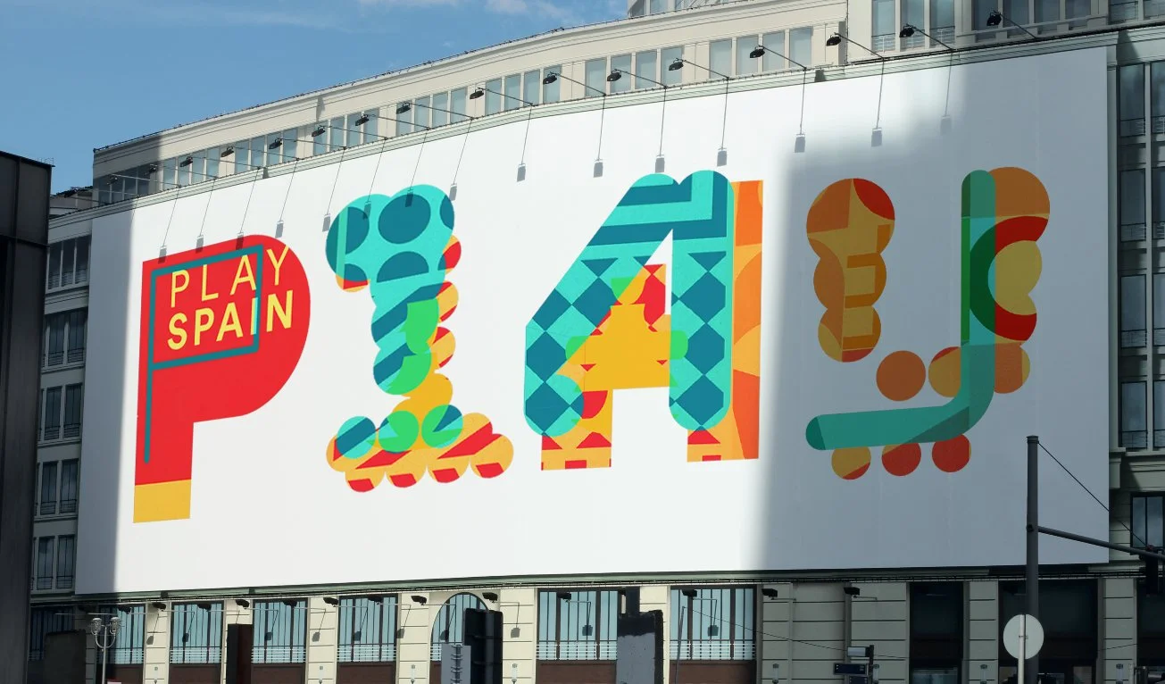
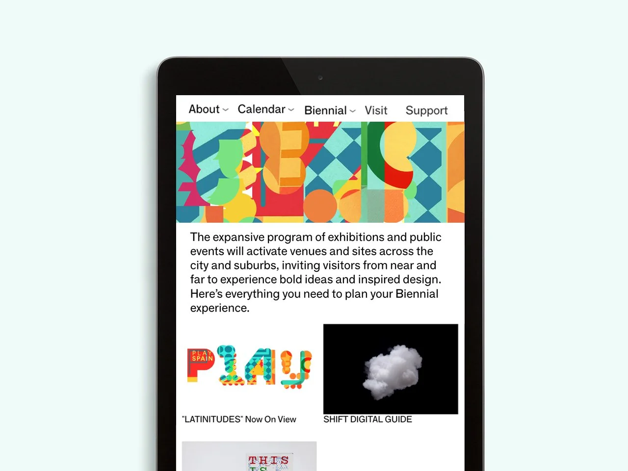
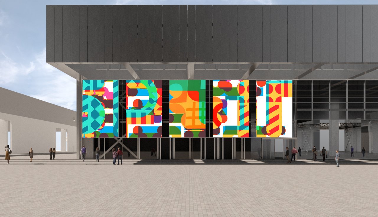
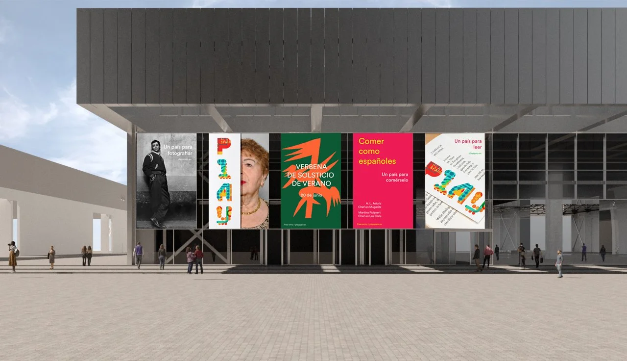
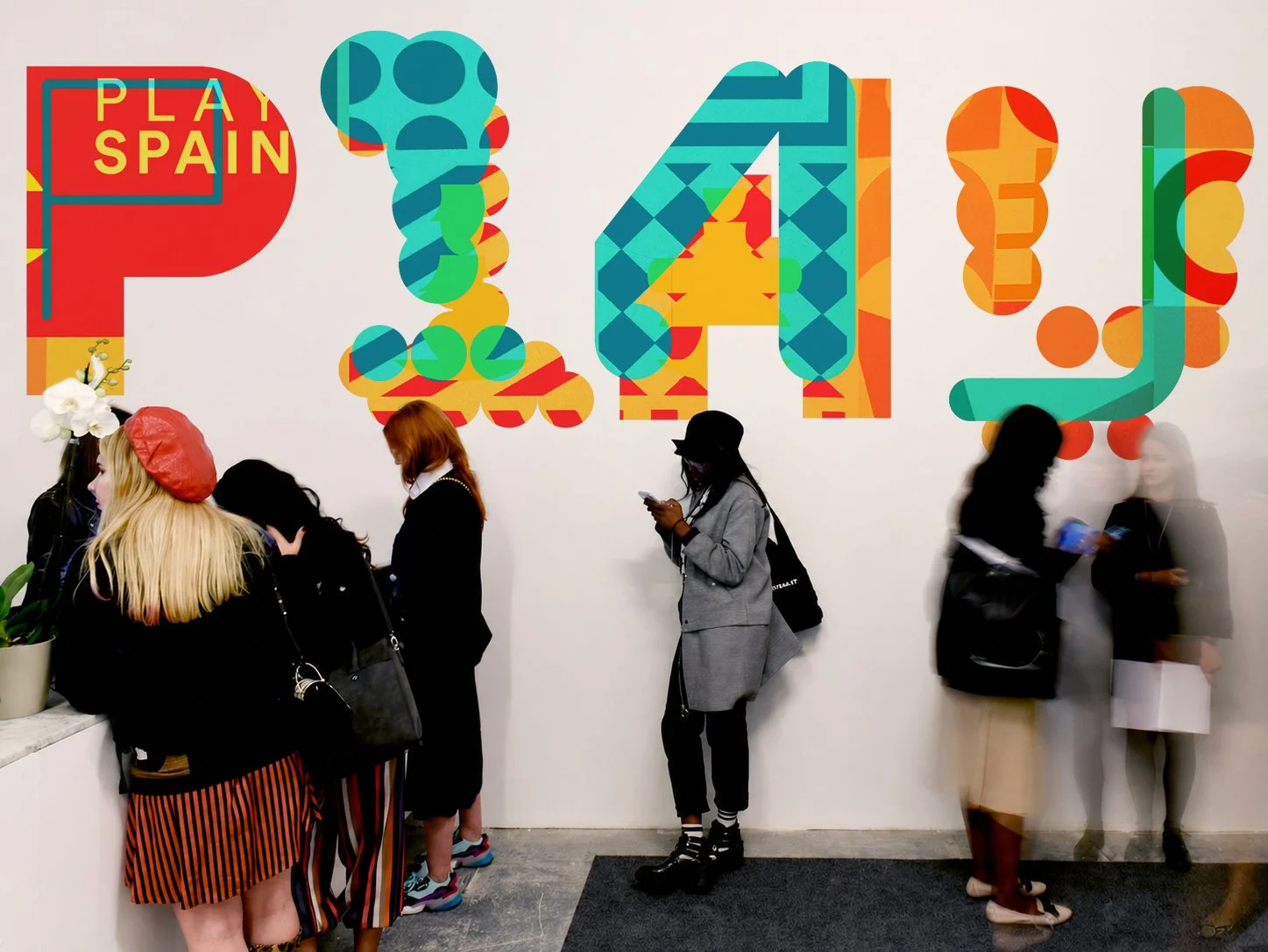
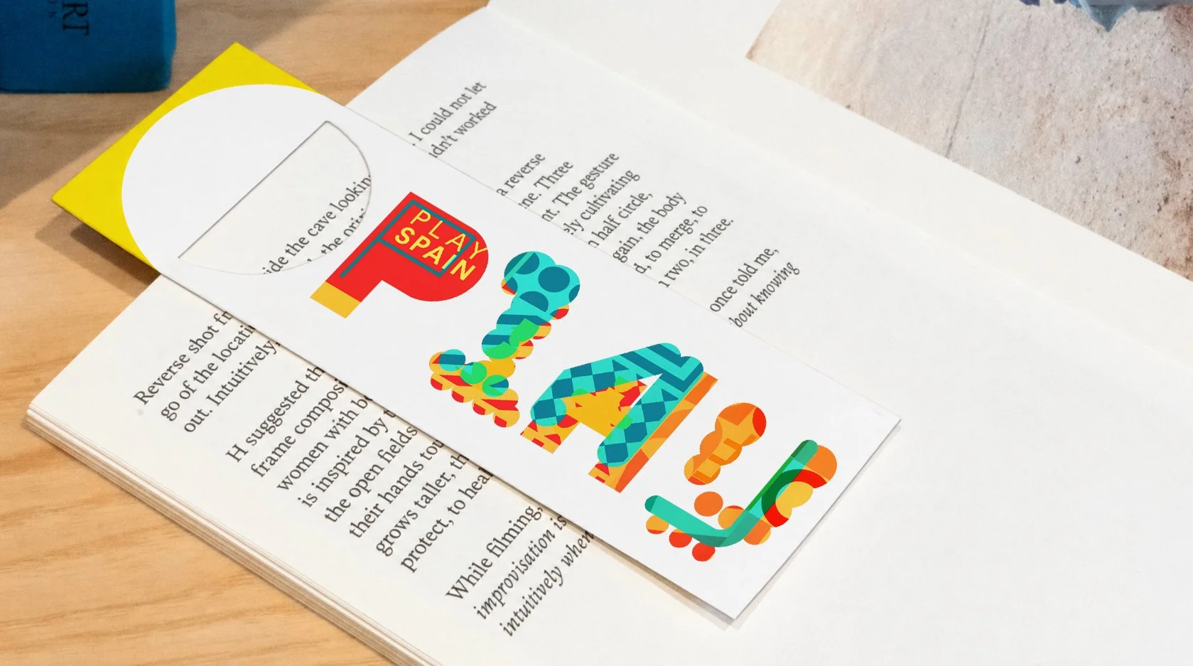
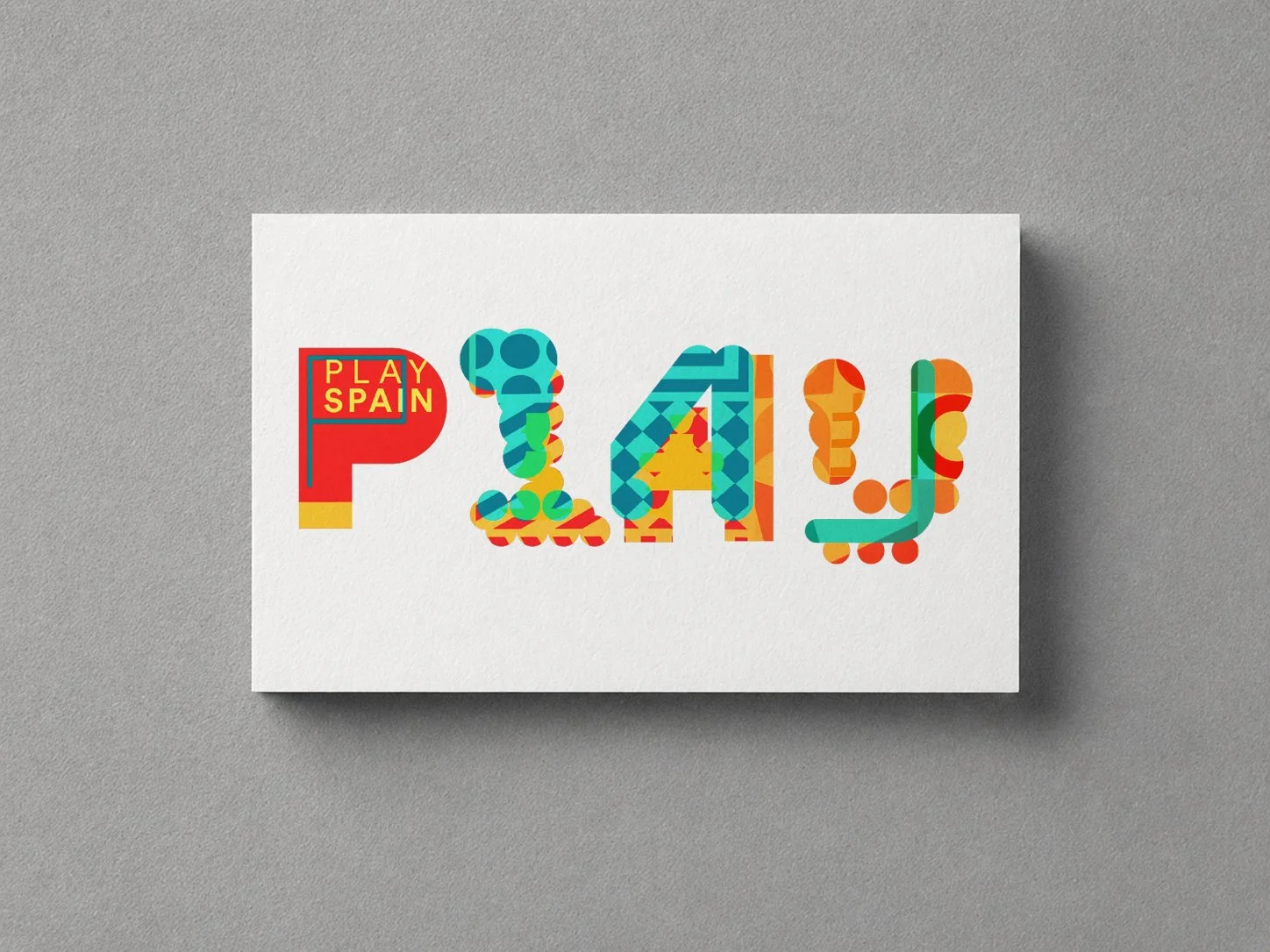
The visual identity proposed for the Spanish Pavilion in this project is constructed as a playful visual system in which each letter functions as a piece of a game in itself. Far from a uniform typography, the forms are fragmented, overlapped, and reinterpreted through vibrant colors, textures, and geometries that evoke the dynamics of play: combination, variation, and surprise.
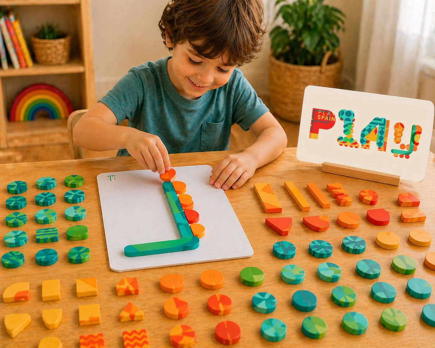
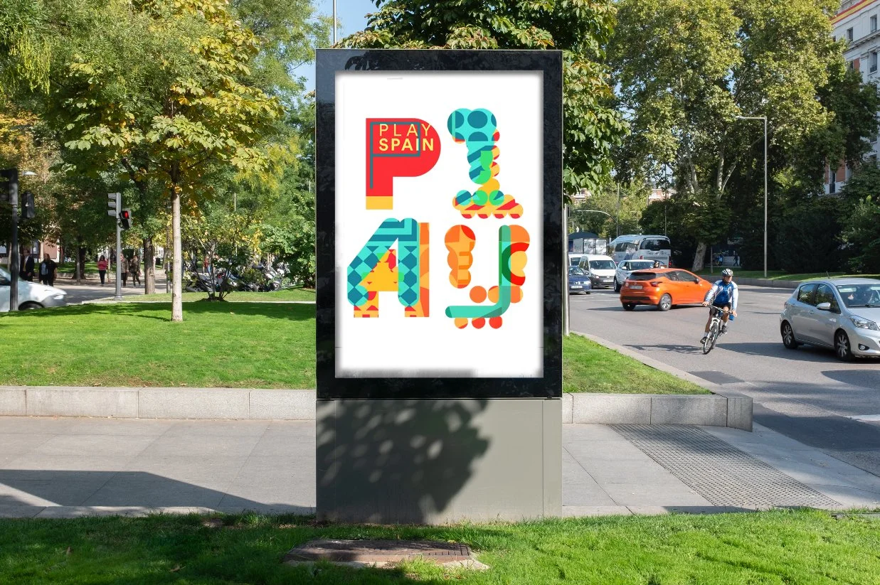
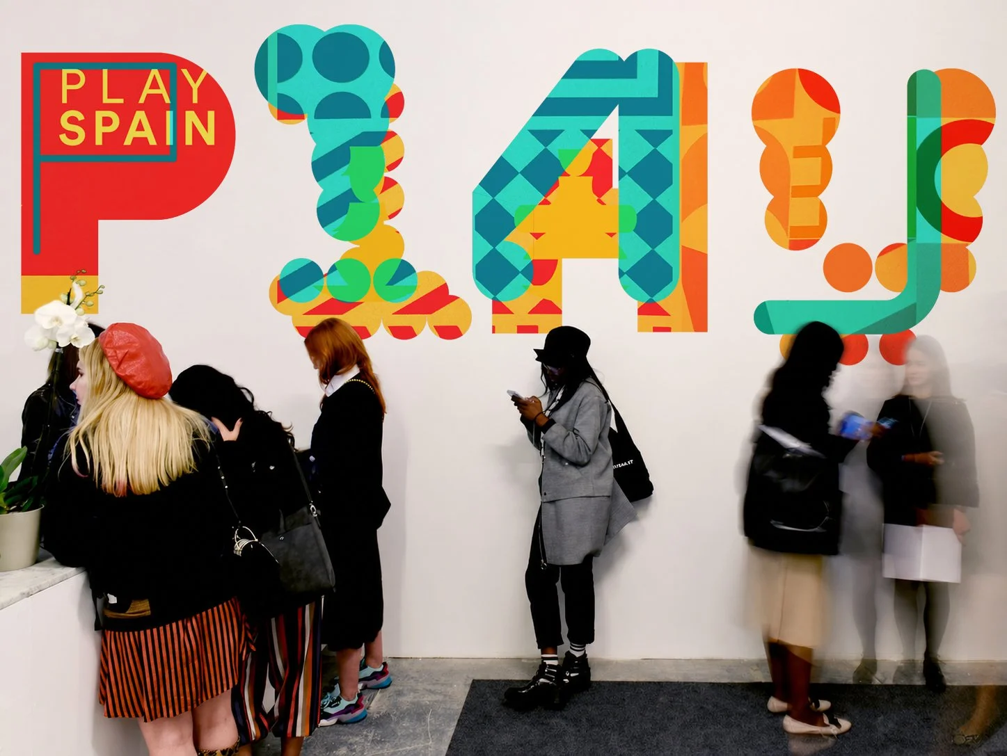
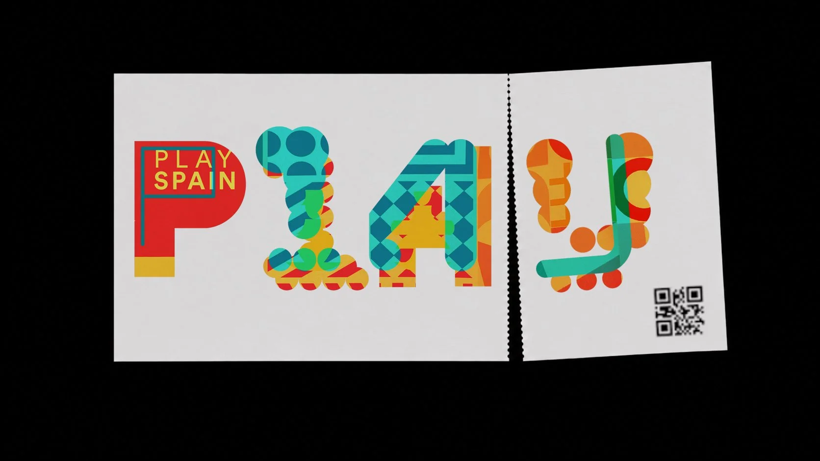
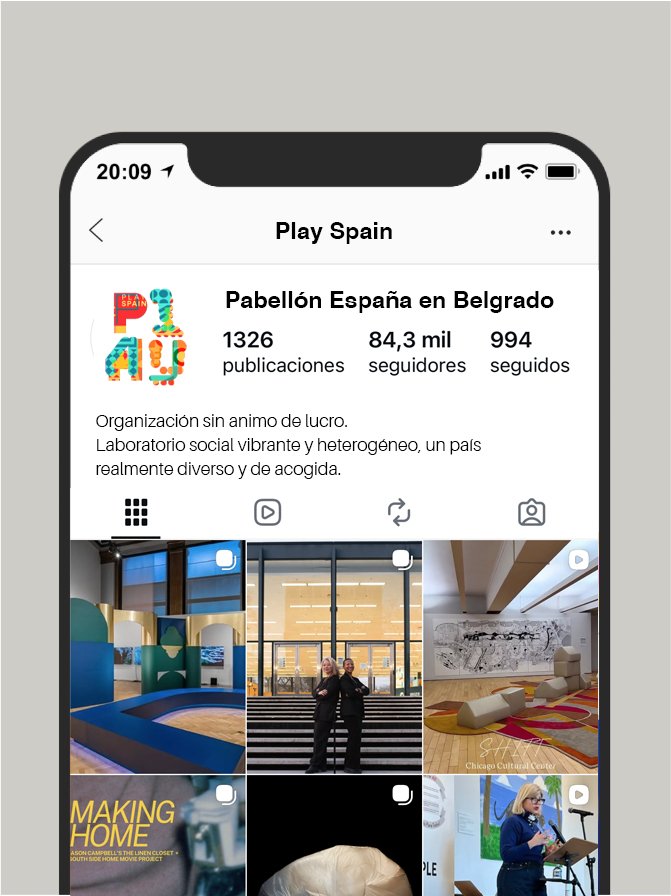
Cada carácter parece ensamblado a partir de elementos diversos —círculos, patrones, módulos— que recuerdan a fichas, tableros o construccio- nes infantiles. Esta lógica compositiva introduce una idea clave: el juego como proceso abierto, donde las reglas no son rígidas sino que invitan a ser exploradas y reinterpretadas.
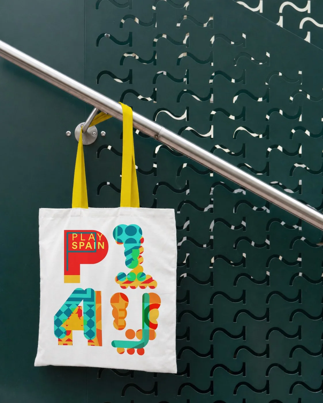
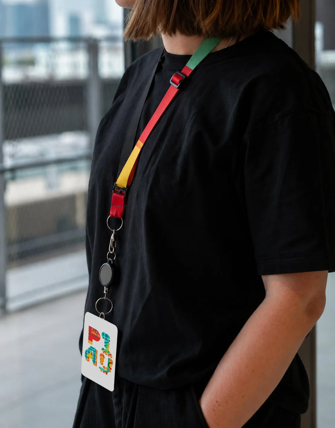
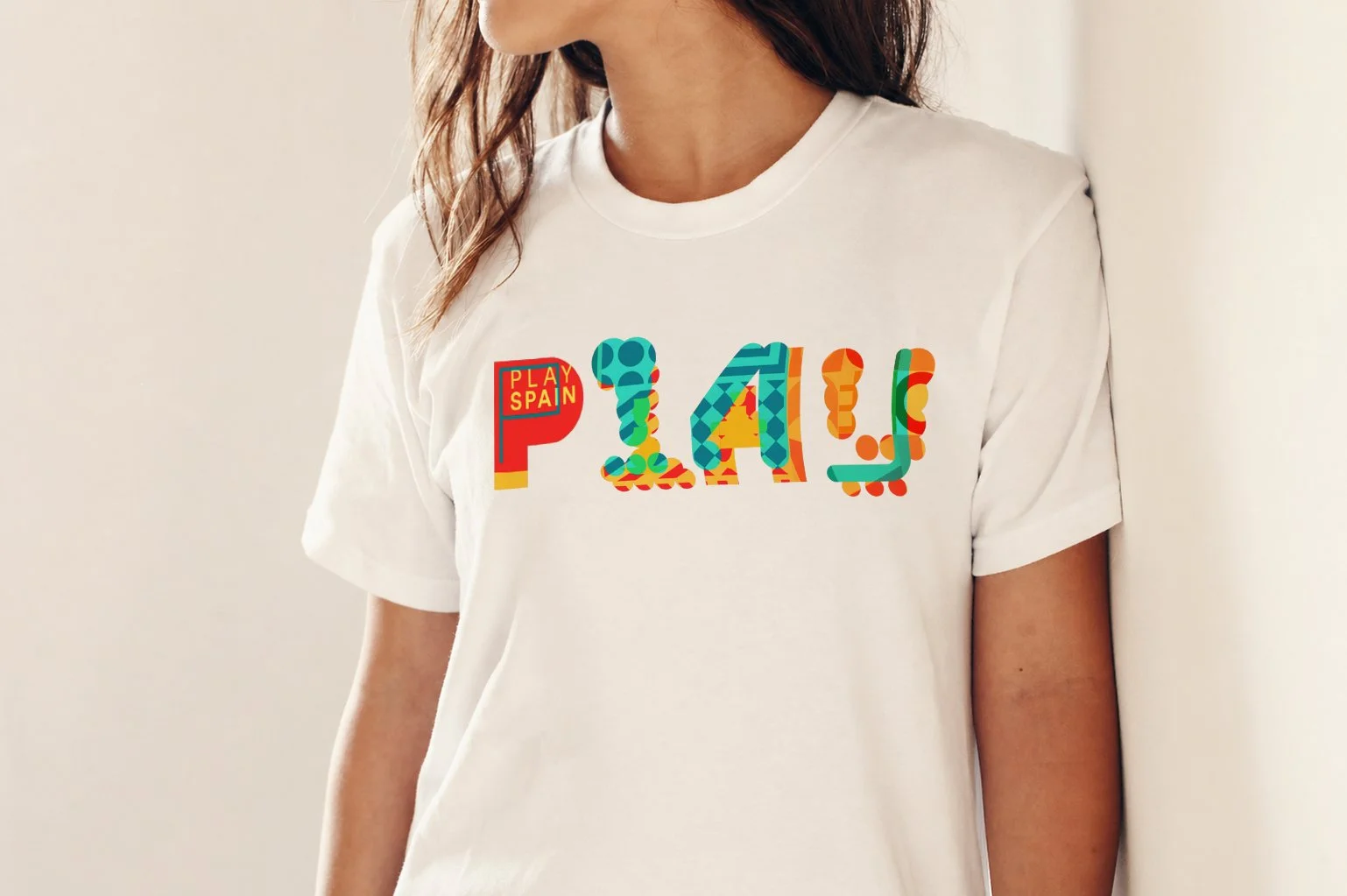
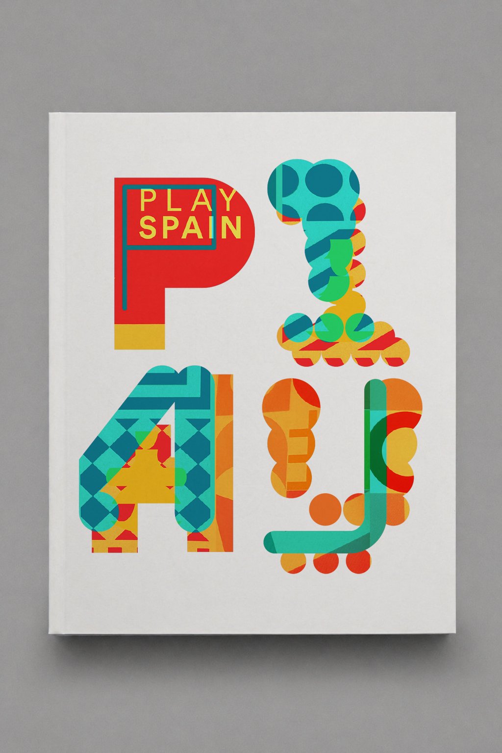
The use of color reinforces this playful dimension. The chromatic layers not only add dynamism but also suggest movement, interaction, and constant change, as if the logo were in permanent transformation. There is no single, fixed interpretation, but rather multiple possible visual combinations.
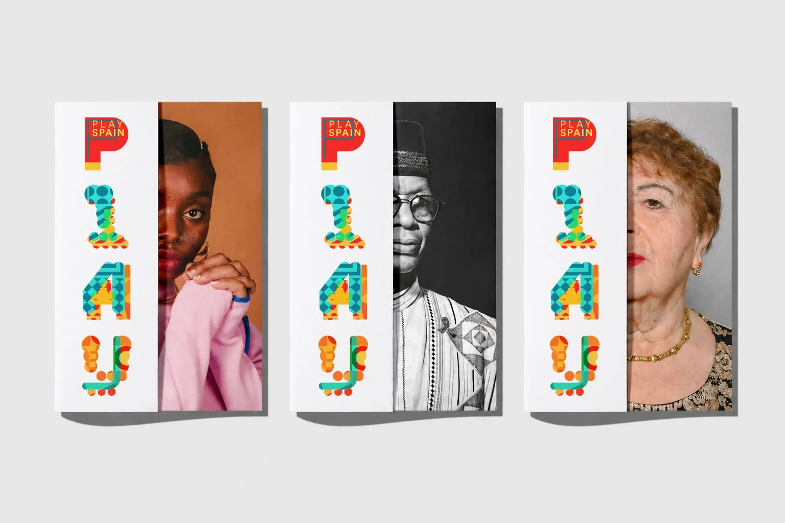
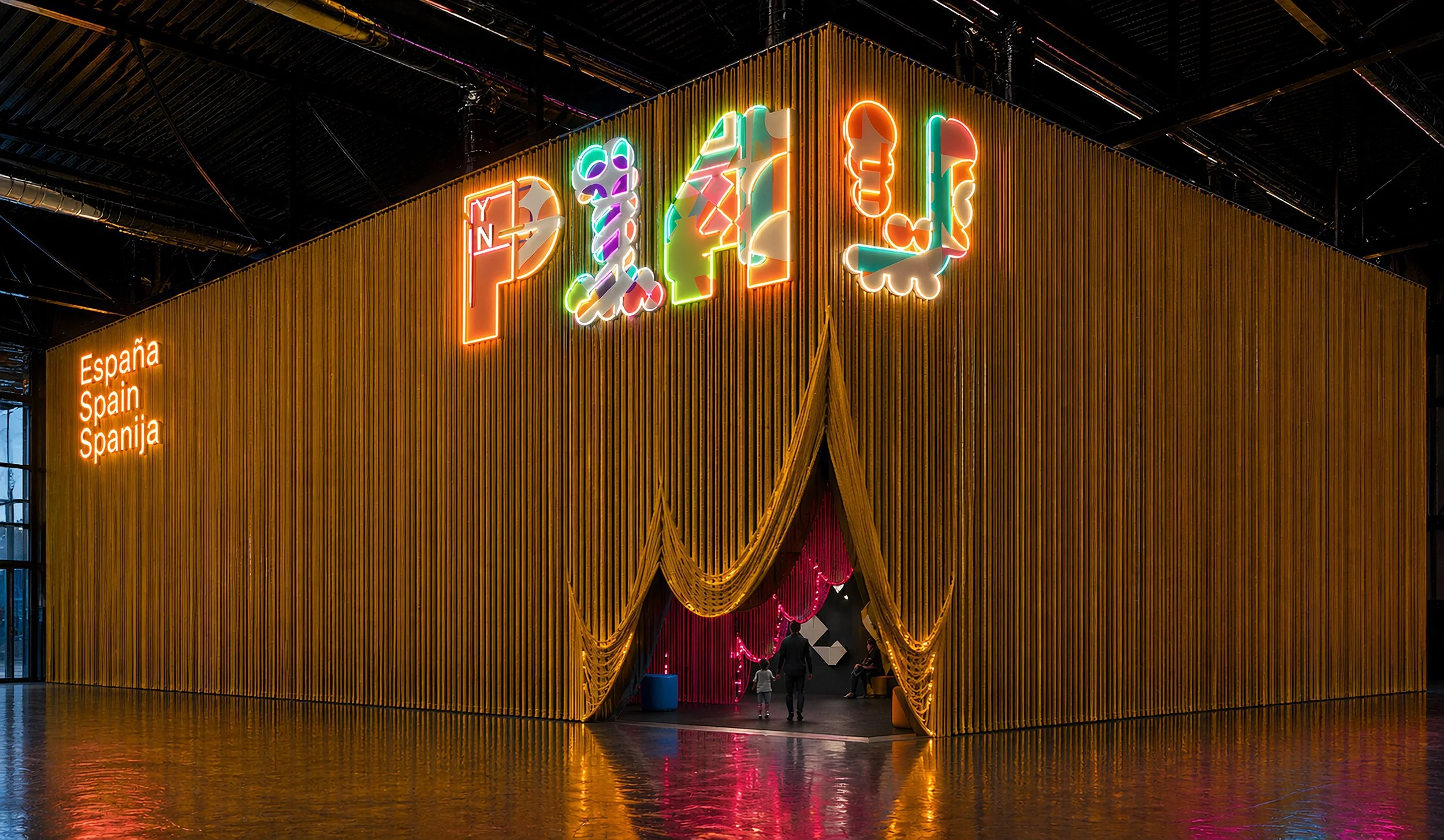
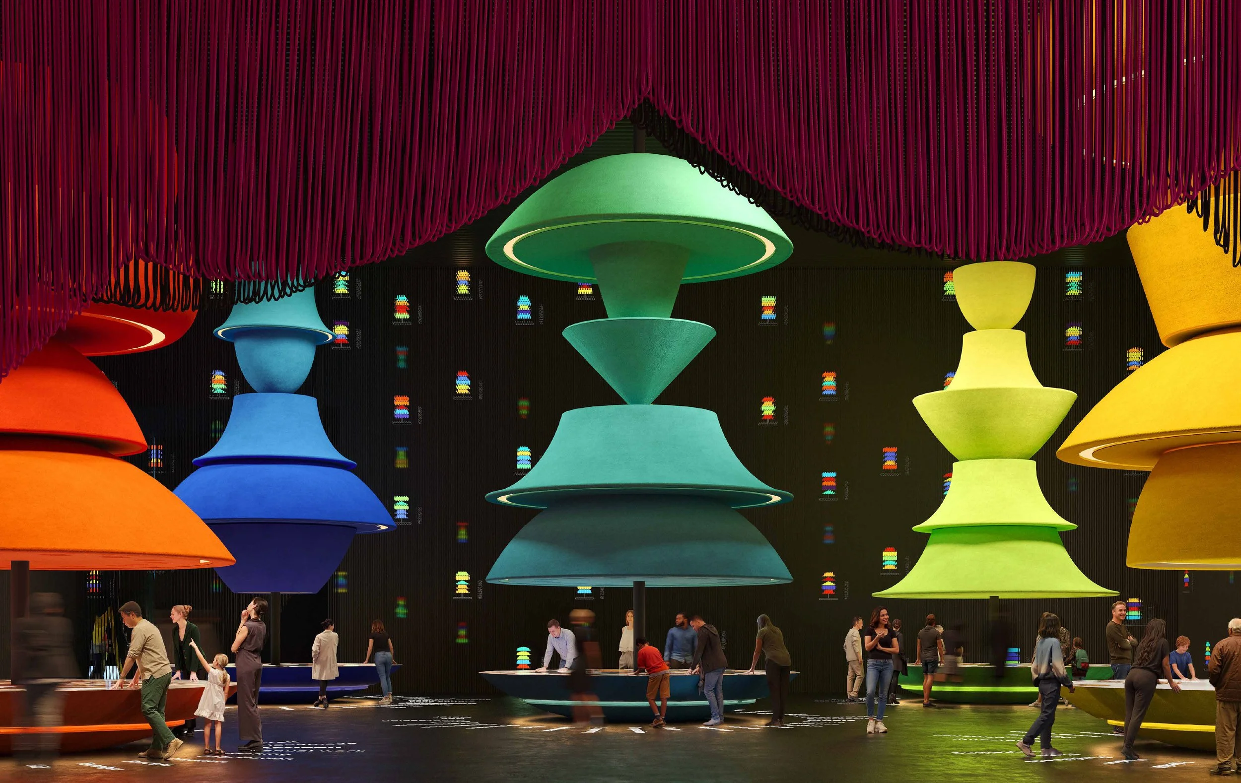
Thus, the logo does not represent the game literally, but rather acts as a game: it proposes a visual language based on freedom, experimentation, and the coexistence of differences. Each letter is autonomous but forms part of a whole, reflecting the idea of playing together under a shared system.
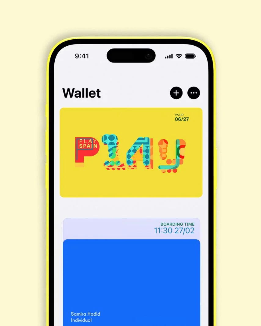
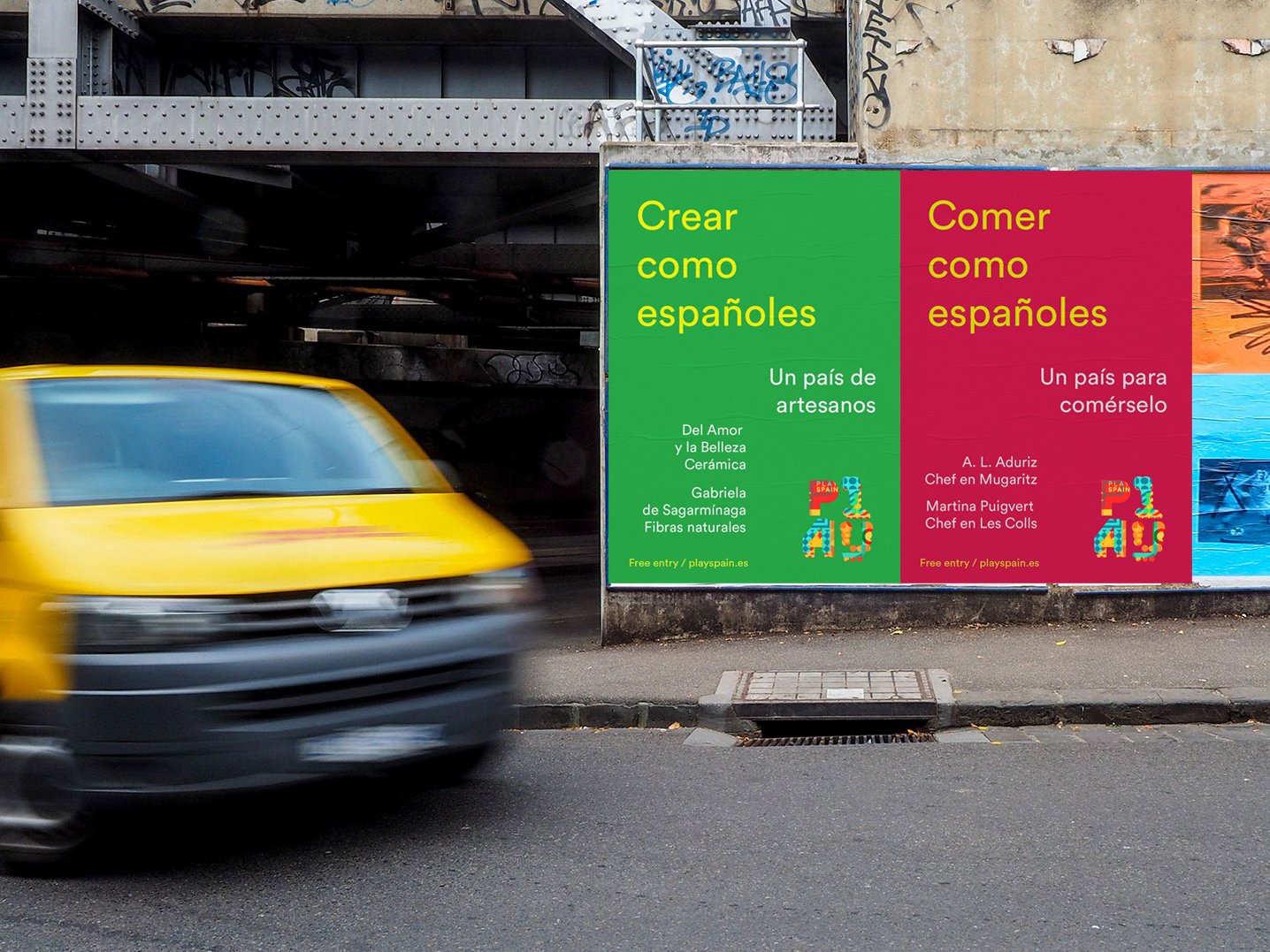
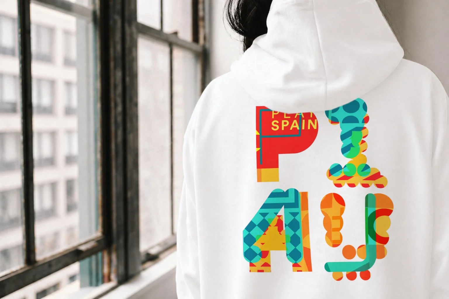
In this sense, the logo translates the game as a form of relationship: a space where diversity is articulated, where the structured and the spontaneous coexist, and where identity is built through interaction.